
Google testing black ad labels.
Is Google no longer going green with their ad labelling in Search? Here we look at the what and why.
Currently the Google Ads label consists of green text with a green border. But with this recent test the label appears as bold black text without any borders. This is, of course, not the first time that Google has tested changes with ad label styling. There have been numerous iterations of the ad label as they test and learn from varying degrees of differentiation between paid and organic results. At this stage, it’s not clear how wide spread the testing is but perhaps it will be a change that becomes permanent later in the year. A change that undoubtedly makes the look and feel of paid ads more in line with organic results.
As a result, it will may be harder for the casual user determine what paid results from those that are organic. Whether this matters from the perspective of the user isn’t obvious. However, it is unlikely to have a huge impact as long as the results served by Google remain relevant to the user. It is possible that we’ll see further variants of this testing through the year given that Google tend to test changes of this nature for statistical significance before deciding whether to implement it or not.
It is interesting to note that the look of the search ad label has changed almost every year since its inception. Every year there seems to have been a new iteration on the ad from allowing more characters in the form of additional description lines and headlines to new extension formats. PPC ads are ever-evolving, growing in size and they show no sign of stopping.
A step back in time.
As mentioned, the PPC ad itself appears to be taking more landscape so let’s take a look at how it has grown and changed over time. The illustration below is a visual history of Google Ad labelling, originally published by Search Engine Land (original article and image updated in June).
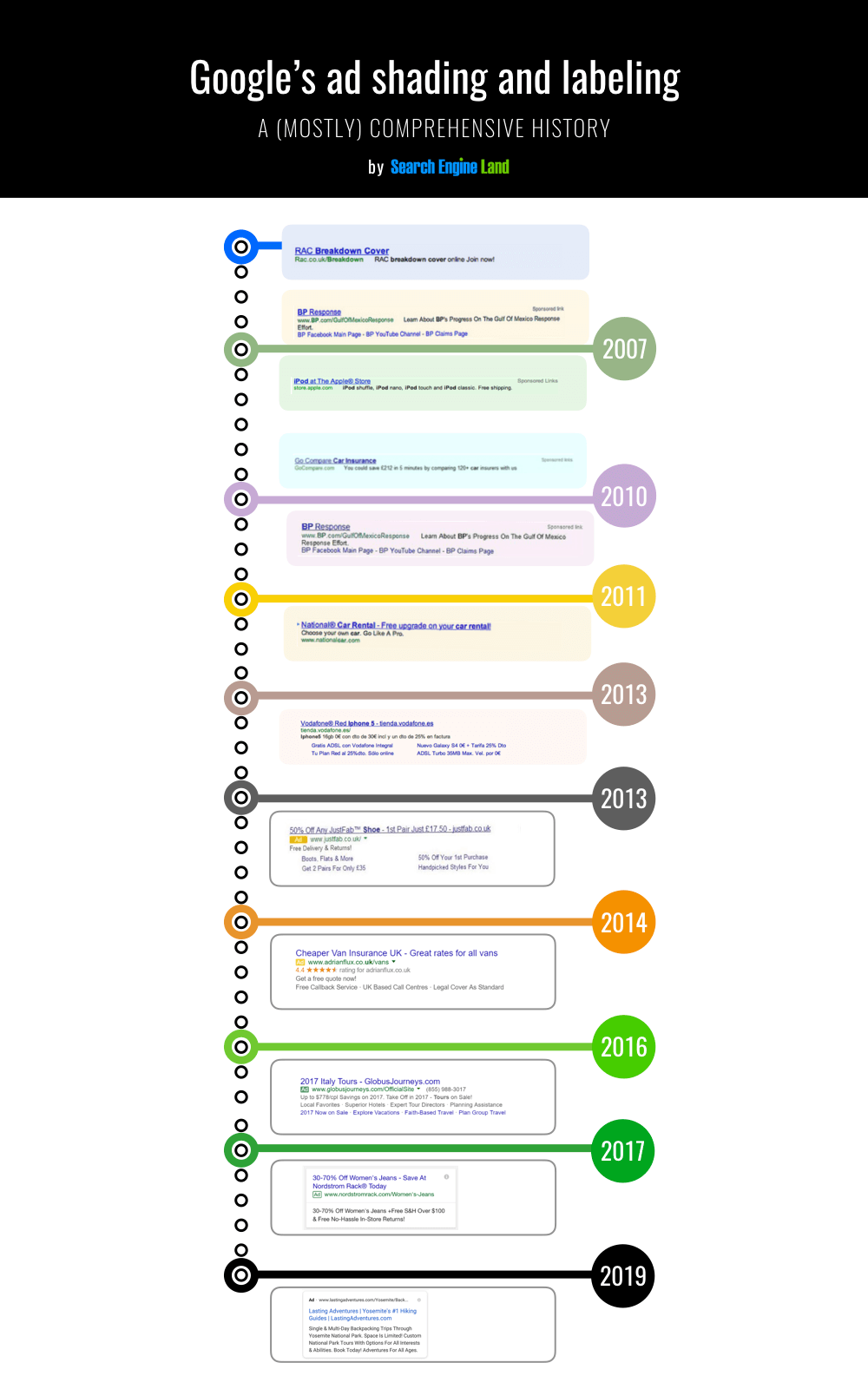
From early 2007 to 2017 we can see how the labelling and style of the ad unit has changed both in terms of colour palette as well the background gradually becoming a lighter shade over the years. The look of the ad has remained relatively consistent in recent years until the discovery of this latest test with the black ad label. So why the change? We believe it should be viewed in the context of attempts to improve average ad clickthrough rates and nothing more. Google actively test changes in search regularly, some of these are announced and others go under the radar. Some make it through to a full rollout whilst others are shelved. Like any business seeking to better the bottom line, testing and learning is necessary. Indeed, it will be interesting to see how the search results page changes over the next 10 years. How do you think paid ads will look in another 10 years time? Tweet us @alitylondon.