
What's the deal with dark-mode?
It has arguably become one of the most popular and highly anticipated trends in recent months.
On the surface.
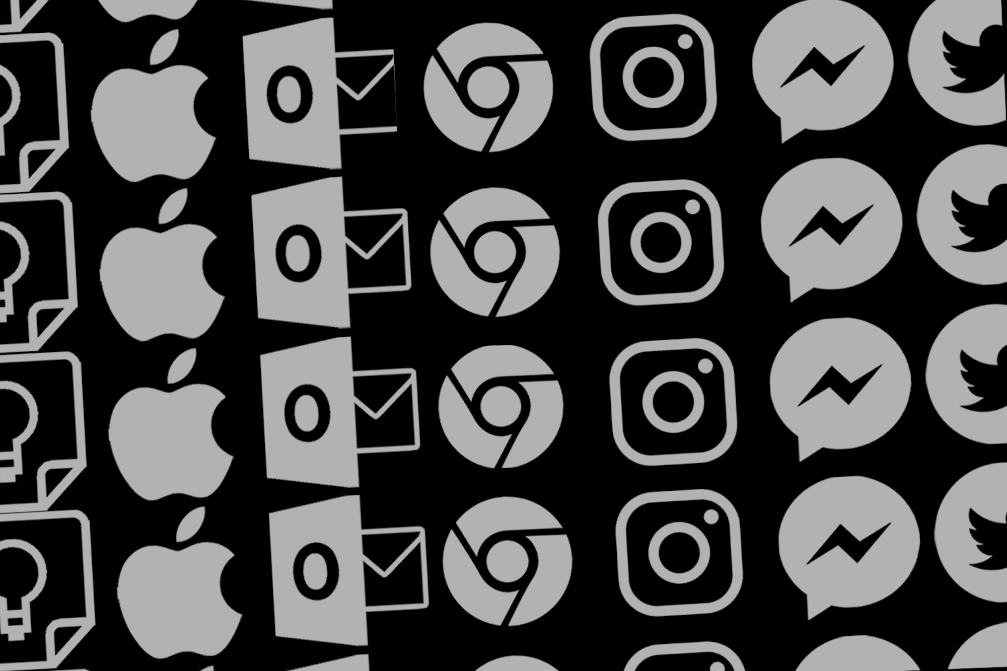
We first noticed dark-mode as a feature we could use on Outlook – and naturally many of us jumped on it. Next up was Messenger, closely followed by Google Keep, iOS Mac, and Chrome. The latest introduction was on the new iPhone iOS update which, put simply, looks awesome. And now, Instagram has jumped on the bandwagon too. Dark mode on Instagram has got to be our favourite so far. If you’re unsure how to make the change, this will break it down for you.
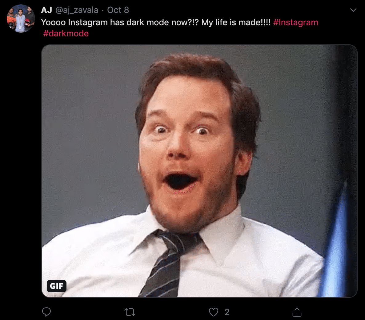
It has transformed our feed, is kinder on the eyes and it’s just different, which is always exciting. We were interested to see what the general public thought of this latest platform update, and a quick scroll through Twitter reveals some interesting responses, some of which were positive.
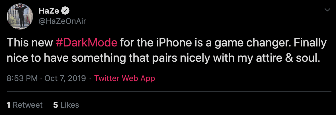
And others that, well, are a little darker...
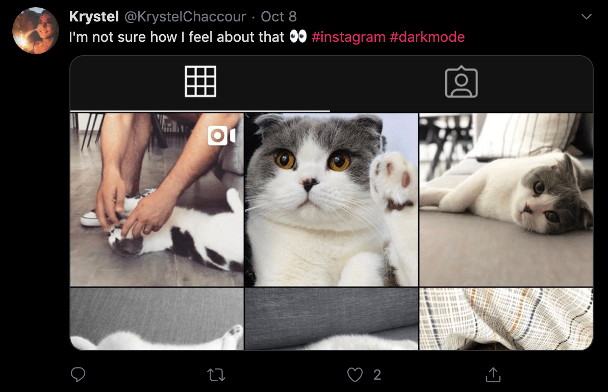
This cat-dedicated account seems to be on the fence:
And some people think dark mode has ruined the feed they have spent years carefully curating…#snarkmode
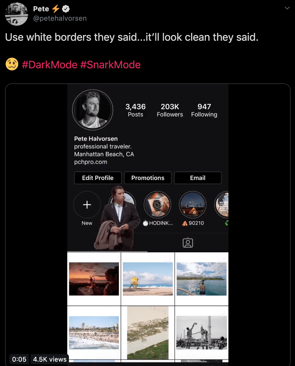
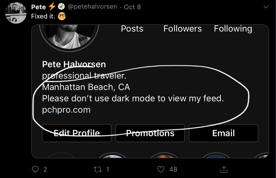
To be fair, we feel the pain of the white-border users… that would bother us too!
What's the impact for digital marketers?
Now that dark-mode is a ‘thing’, it’s important to consider that your content will appear on both a dark and light mode format. So pick your colours carefully, the simpler the better – nobody likes a clash. We would like to see the introduction of targeting based on the user’s selection of light or dark-mode. This would present unique ways to engage with audiences based on these preferences, allowing advertisers to introduce witty ad copy and image choices. We’re watching developments here closely.
We also wonder how dark-mode will integrate itself elsewhere across the web. Will we see web designers doing the same and introducing the option to change mode on the frontend? Or perhaps have this automatically change based on time of day? We can imagine a world where website engagement and experience becomes as important as the immediate conversion. Tools such as Optimizely and Google Optimise, among others, already allow for tailored experiences on the web and we are confident that we’ll see these develop further over time.
Another interesting space for dark mode would be email marketing. Email is not dead, people! If you’re including an image/logo of any kind, make sure the file is a PNG so you don’t have a large white background that the image is based upon. This would not look great against a dark-mode background. It adds another shape and another colour to the format which overcomplicates your already perfectly planned template. Say you’re a light-mode user and you’ve picked some dark text for an element of your newsletter, which looks great against a white background. Against a dark-mode background though, not so much. You must now consider image choices and colour schemes carefully, choosing those that better compliment both modes.
In terms of the impact dark-mode generally has on the marketing world; we say watch this space. It’s difficult to say whether it is merely a design trend or actually a successful long-term feature. There has also been conversation around whether brands themselves will adopt this trend. Some may be hesitant due to the fact that it’s different. Indeed, there is a general consensus in the advertising industry that consumers are more responsive to brightness, clarity and white space. As a result, it’s possible that we won’t see all brands conforming to this style in the near future.